
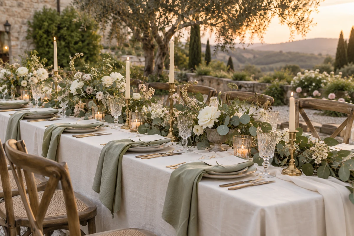
Wedding Themes, Colors & Decorations
A wedding looks designed when everything speaks the same visual language. This section brings together theme ideas, color schemes and the stationery that carries them, so your invitations, signs and table papers all match.
wedding themes
Start with the venue and season, then repeat one palette across invitations, signs and table stationery.
Make the right choice for your wedding
Our signature palettes are botanical: sage green, olive, warm cream and a touch of gold. Every product in the shop is built on these coherent color systems.
Start from the venue: garden and countryside settings call for greenery and watercolor botanicals.
Pick one dominant color and two supporting tones. That trio drives every printed piece.
Choose stationery from one collection so invitation, program and signs stay consistent.
Season matters: soft sage and cream suit spring and summer; deeper olive and gold carry autumn.
A practical comparison before you decide
| Decision | What to verify | Why it matters |
|---|---|---|
| Best format | Start from the venue: garden and countryside settings call for greenery and watercolor botanicals. | Save your palette (most of our product pages list the exact color codes). |
| Best moment to prepare it | Pick one dominant color and two supporting tones. That trio drives every printed piece. | Share it with your florist, decorator and stationery: one reference for everyone. |
| wedding color schemes | Choose stationery from one collection so invitation, program and signs stay consistent. | Use matching templates from the same collection for every printed piece. |
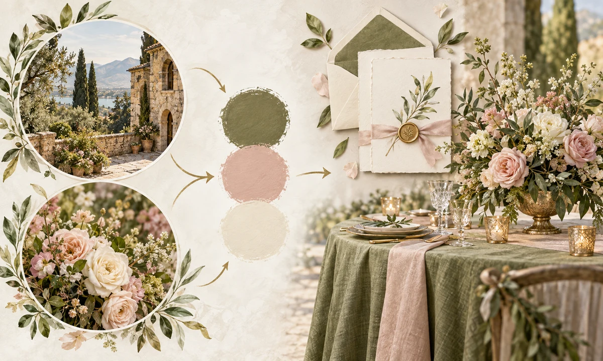
From template to finished piece
- Save your palette (most of our product pages list the exact color codes).
- Share it with your florist, decorator and stationery: one reference for everyone.
- Use matching templates from the same collection for every printed piece.
- Keep accents (gold, foliage) to small doses: restraint reads as luxury.
Build the theme around the setting
A theme works best when it grows from what is already present: the venue materials, the season and the light at the ceremony time. Choose a restrained palette, then repeat it through florals, stationery and table details. This creates a recognisable atmosphere without forcing every object to carry a decorative motif.
Keep the whole wedding visually coherent
Choose one collection, keep the same palette and repeat only a few visual cues. Guests then recognise every piece as part of the same celebration, while each format remains easy to use.
Common mistakes to avoid
- Choosing a format before deciding how guests will use it.
- Mixing unrelated fonts, colors and artwork across the same celebration.
- Leaving names, quantities or final wording until the production deadline.
Final checklist
- Purpose is clear at a glance
- Names and dates are checked twice
- Mobile and print versions are legible
- Colors match the rest of the suite
- Final file is tested before sharing or printing
Frequently asked questions
Do the templates match across products?
Yes, collections share the same artwork, palette and typography, so every piece of your wedding day looks like one set.
Can I change the colors of a template?
Text colors are editable in every template. The painted botanical artwork itself stays as designed.
Which theme fits a garden wedding?
Eucalyptus and greenery watercolor themes are made for outdoor and countryside weddings: natural, elegant and timeless.